One thing that's important to remember when choosing a colour - from the time the selection is made until the room is complete - is that the colour means nothing without context. Many colours look great alone, but look awful when paired with other items. Some colours look fabulous in one setting and ugly in another (one common reason people call me to choose a colour is that the colour they chose because they liked it at a friend or neighbour's looked completely different on their walls with their furniture!) It's important to consider the whole picture when putting together a room - quite often a colour can give you that "what were you thinking?" moment while you're painting...because you're seeing it on the wall alone, not surrounded by the items it relates to. I often remind clients to wait until the room is put back together before they make a final judgement on whether they like the colour.   I've specified a couple of bolder colours this month (these 2 above...going in 2 different homes) - and when I look at the paint chips they can seem pretty "out there", especially for living room walls...but once they're put beside the furniture and accessories that have bits of the wall colour in them, they end up looking exactly as they should. Context counts! |

Showing posts with label paint. Show all posts
Showing posts with label paint. Show all posts
Thursday, July 7, 2011
C is for Context (and colour!)


Saturday, June 4, 2011
Biggest Decorating Mistakes - Outdoor Edition!
A while back I talked about the most common decorating mistakes people make (if you missed it you can read the article online here). Now that the warmer weather is here (I think!), it's time to focus on the outside of the home too. Many people focus on their home's interior and ignore the outside - but it's the first thing people see. And unlike the interior, everyone can see it, not just the people who come inside. 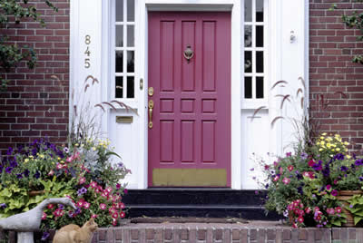 The most common outdoor decorating mistake starts at one of the most important areas in terms of making your home look attractive - the front door. Many people either ignore it or paint it a colour that does nothing for their curb appeal (or worse, works against it!). The front door is a big part of how your house looks. For such a small surface area, it has a huge effect! The wrong colour on the main door makes the colour of the house look "off". The right front door colour can pull everything together and make your home look inviting. You want to choose a colour that stands out but that works with the rest of the home - brick, stone, trim, accents, etc. (And this colour is very rarely, if ever, white - don't be afraid of colour here!) Take into account the different colours found in the brick, whether the colours are warm/cool, dull/fresh, etc. A small can of paint and a few hours will make a huge difference in the look of your home! |
Wednesday, March 9, 2011
Product Review: FROGTAPE
I finally had enough of my kitchen last week and decided to paint the wood trim above the cabinets white (which of course led to painting the backsplash and walls!). It's no secret how much I dislike painting (and how awful I am at it). Clients often ask me if I paint as well, and I always tell them I would have to pay them to let me paint, that's how bad I am... I especially hate taping - it never seems to help me anyway, and I end up with rough edges and with paint everywhere. This time we used Frogtape ("the only tape treated with Paintblock", according to the package)...and I have to say, I love it (well, as much as someone can love painter's tape...). Peels off easily and leaves a nice, straight edge - it's like someone else painted :) |
Thursday, February 10, 2011
Accent Walls
What's one of the most common things clients ask me about? Accent walls! The main thing when deciding to do an accent wall is to use it as an actual "accent" and not "just because". Many people go to accent walls when they can't decide between 2 colours. You want your accent wall to be an area that should be highlighted, so the choice of wall is as important as the colour. To make your accent wall work, follow these tips: The accent wall needs to relate to something in the room. Carry the colour and tone of the accent wall into other elements. If there is nothing else in the room that coordinates with the accent wall, it will look out of place. Bring the accent colour through with throw pillows, area rugs, upholstery, drapery, floral arrangements, etc. Avoid leaving the other 3 walls white. The most effective way to do an accent wall is to paint the accent wall in a darker colour and paint the remaining walls a light or medium neutral tone that either relates or contrasts. Leaving the other walls stark white makes the accent wall less effective. Accent walls can also be used to change a room's shape. An accent wall can visually shorten a long room or widen a long one. One place accent walls tend to be used incorrectly is in a long hallway - painting the end wall of a hallway a darker colour doesn't have the same effect as it does in a long room - because you only see the one wall, the dark colour recedes and can make the hall seem even longer. A better option is to paint one long wall one colour, and the other long wall a slightly darker version of that colour. Accent walls can be great when used correctly. Because it's only one wall, you can change the colour easily when you tire of it, and it's easy to be more adventurous with colour when it's only one wall and not the bigger commitment of all 4 walls! |
Wednesday, October 6, 2010
Using Colour to Fix Problems
This homeowner had a bit of repair work to do after a picture frame fell off the wall. Once the holes were fixed, another problem popped up - the walls had been painted by a previous homeowner, so they didn't know the colour or brand to get more. The home is a somewhat open concept, so the wall continued down the hallway, into the living and dining areas as well as the entrance - and there were no suitable corners to make a colour change - which meant the homeowner would have had to paint all the walls toavoid a choppy look. They really didn't want to paint more than necessary, so we needed to come up with something that would cover the repair job and only involve minimal painting.
The solution? Colour to
 the rescue! I had previously specified a dark brown accent wall in the adjoining living room to fix a sofa/undertone issue (I wrote about it in a post last year)...so we took the rest of that paint and used it to createa colour block in the hallway. This allowed the homeowner to cover the repair, accent their photos, and only paint a few square feet.
Sunday, August 8, 2010
Overcome Your Fear of Colour
When people talk about what scares them, many are quick to mention the usual fears: spiders, snakes, flying, heights, clowns, windchimes (ok, maybe the last one is just me...). One you don't hear mentioned is thefear of colour.

While “chromatophobia” is an actual fear of colours, the fear I'm talking about is really not so much a fear of colour as it is the fear of making a mistake. Many people stick with a very neutral colour scheme not so much because they like it, but because they're scared to add colour, or more accurately, the wrong colour.
Here are a few tips to help overcome that fear of adding colour to your home:
- Use Colour in Small Doses
If you don't think you can handle boldly coloured walls and furniture, you can add smaller hits of colour with your accessories and accent pieces. If you think you want to try red, for example, but aren't ready for red walls, go neutral on the walls and furniture, and add your red with throw cushions, vases, and artwork.
A positive side to this is that you're generally less likely to tire of a coloured pillow than a brightly coloured sofa, and a cushion is much easier to replace or re-cover.
- Balance It With a Lot of White
If you don't want to be overwhelmed by a colour, you can tone down a vibrant shade by making sure the rest of the space has a lot of white or neutral colours. Try a collection of large white vases, a mainly neutral area rug with small splashes of colour, or slipcovered white sofas.
- Test Paint Colour First
If you're hesitant about using a bolder paint colour, the best solution is to test it first. A $5 sample pot can save you a lot of trouble and gives you a chance to see how a colour performs before you commit. Rather than painting the sample directly on the wall, paint a large piece of bristol board or foam-core. This way you can move the colour around to different walls and see how it reacts in different light, at different times of day, and with different pieces of furniture.
Once you've seen that you like the colour on the large sample in the different scenarios, and see how it works with the rest of the things in the room, you'll be less afraid to try it on the whole wall.
Studies show that a colourless space can have a negative effect on our mood, so adding colour can do more than just make a room look good – it can help you feel good, too! Try one of these tips and see what colour can do for you.
Saturday, April 3, 2010
Where Do I Stop Paint Colour?
One question I get asked a lot is where to stop paint colour. Here are a few guidelines for a couple of different scenarios:
If the ceiling in your room goes up on an angle from a low wall, continue the wall colour upwards – otherwise it brings the ceiling too far down and makes the room look oddly proportioned.
When it comes to rounded corners, stopping the colour would create an odd line, so colour should be continued. Only stop at straight corners/edges.
A common scenario is the living/dining room combo. When both rooms share one long wall, that wall should be one colour - stopping anywhere along that wall will look choppy. If you choose, you can paint the entire wall a different colour from the other walls in the room to define space – but that wall needs to be all one colour along its whole length.
Subscribe to:
Posts (Atom)
